
Customise the User Interface in the Java PDF Viewer
The JPedal Viewer is a fully featured PDF Viewer with features for Viewing, Searching, Extracting and Converting PDFs. Not all features will be required for all users so the Viewer uses a set of properties to allow you to control its appearance and which features are present in the Viewer.
These properties can be controlled via a properties file or a Map of properties provided to the Viewer.
Properties File
The Viewer can load a properties file in three ways.
- Specifying a location of a properties file with the “org.jpedal.Viewer.Prefs” VM argument.
java -Dorg.jpedal.Viewer.Prefs="file://properties.xml" -jar jpedal.jar --view - Providing the properties file path to the Viewer constructors Viewer(String) or Viewer(Accessible, String). The later can be used to embed the Viewer in another application, a detailed tutorial for this can be found here.
//Create a Viewer object with properties path specified final Viewer viewer = new Viewer("properties.xml"); //Set up the viewer for use viewer.setupViewer(); - Otherwise, JPedal will load a file called .properties.xml in the same directory as the JPedal jar. If it is not present one with the default properties will be created for you.
The VM argument and Viewer constructors can specify a location within the jar, a server location, or from the local machine by starting the address with jar://, http://, or file://.
If no properties file is present (such as when the Viewer is first opened) the Viewers default properties will be used, and a new file is created when the Viewer closes. This new file is created either in the location specified by the VM argument, if set, or the same directory as the jar.
Properties Map
The Viewers properties can be specified by a Map loaded into the Viewer.
Properties loaded this way may still be edited whilst the Viewer is in use but will not be saved between uses. The properties map should use the static keys provided in the PropertiesFile class as detailed in the Viewer Properties section below.
//Create a Viewer object
final Viewer viewer = new Viewer();

//Create a Map for properties
final HashMap<String, String> properties = new HashMap<>();
properties.put(PropertiesFile.KEY_BORDER_TYPE, "0");
properties.put(PropertiesFile.KEY_SMOOTH_IMAGES, "true");

//Load the properties
viewer.loadProperties(properties);

//Set up the Viewer for use
viewer.setupViewer();
When the properties are loaded the Viewer will be updated to match the properties that have been provided.
Altering properties from within the Viewer
Within the Viewer we have a preferences windows that will allow you to set properties files within the Viewer (although you will need to save and restart the Viewer for all values to take effect).
This window can be accessed from the menu item Edit-> Preferences (Ctrl + K).
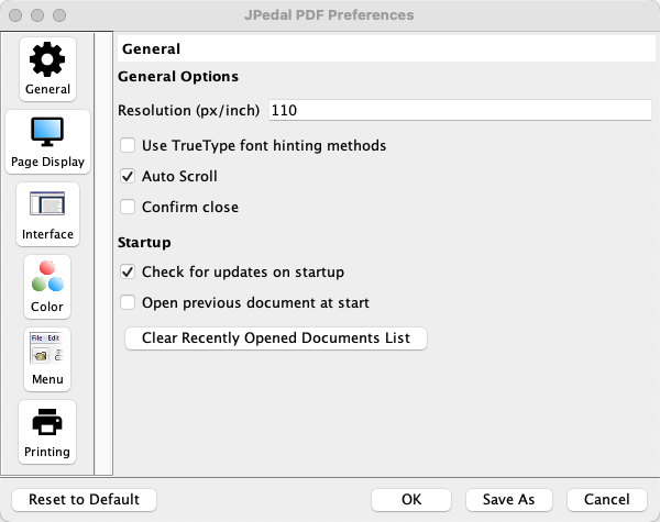
The preferences window contains options for most of the Viewers properties. From here, the Viewers user interface can also be modified from the Menu section.
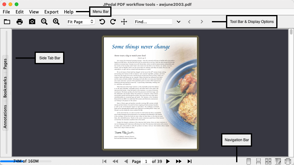
The menu section is divided into 5 tabs, representing a different area of the Viewer (see image below). Each tab contains a tree of elements that allow you to specify individual buttons or elements to hide from view, below each of these is a button that allows you to completely remove this element from the GUI.
Once you have set the properties you want they can be saved to the current properties or a new properties file.
- To save the properties to the current properties file by using the OK button.
- To save to a new properties file use the Save As button. This will leave the Viewers properties as they were before making changes.
List of Viewer Properties
- Recent Files
- Show First Time Popup
- Search Window Type
- Page Border Visibility
- Viewer Look and Feel
- Resolution
- Dynamic Cursor
- Scroll whilst dragging
- Display Tips On Startup
- Menu Bar Elements
- Button Bar
- Display Options
- Navigation Bar
- Side Tab Bar
- Show Menu Bar
- Show Button Bar
- Show Navigation Bar
- Show Side Tab Bar
- Highlight Color
- Highlight Text Color
- Highlight Opacity
- Highlight Color Invert Mode
- Highlight Form Fields
- Highlight Form Fields Color
- Replace Document Text Colors
- Replacement Page Color
- Replace PDF Display Color
- Open Last Document On Viewer Start
- Page Insets
- Side Tab Bar Collapse Length
- Side Tab Bar Expand Length
- Side Tab Bar Consistent Between Files
- Display context menu of Right Click
- Allow option for Mouse Wheel to scroll
- Set Properties to Read Only
- Page Turn Animation
- Custom Window Title
- Confirm Close of Viewer
- Set Custom Icons
- Display Message For OpenFX in PageFlow Display Mode
- Set a Default Printer
- Set a Default Printer Resolution
- Set a Default Printer Page Size
- Set a Printer Black List
- Use Hinting in True Type Fonts
- Text to Speech Voice Name
- Preview Page on Single Page Display Mode Scrolling
- Show Mouse Selection Box
- Separate Cover Pages
- Starting Scale
- Save Scaling When Viewer Closes
- Starting Display Mode
- Save View When Viewer Closes
- Starting Side Tab State
- Save Side Tab State When Viewer Closes
- Starting Selected Tab
- Save Selected Tab When Viewer Closes
- Starting Viewer Width
- Starting Viewer Height
- Save Viewer Size When Viewer Closes
- Save Side Tab Expanded Size When Viewer Closes
- Live Update Search Results
- Enhance Fractional Lines
- Scroll Rendering Delay
- Use Off-Screen Rendering
- Use Full Offscreen Rendering
- Image smoothing
- Ignore Line Widths
- Treat URLs in Text as Clickable Link
Recent Files
Recent files contains a list of files that have been opened recently. It can contain 5 values with the most recent being the last.
Value Recent files contains child elements that define the 5 most recently opened files with the most recent being at the bottom child.
Example
Properties File
<recentfiles>
    <file name="inputFile.pdf"/>
</recentfiles>
Show First Time Popup
Flag to control if we should display first time popup containing information for first time users.
Value A boolean value, true if the popup should be shown.
Example
Properties File
<showfirsttimepopup value="false"/>
Properties Map
map.put(PropertiesFile.KEY_SHOW_FIRST_TIME_POPUP, "false");
Search Window Type
Value to specify how the Viewers search functionality should be displayed on the UI.
Value
- 0 = External Window - Create a second window to contain the search content.
- 1 = Side Tab Bar - Create a tab on the left tab bar to contain the search functionality.
- 2 = Menu Bar - Create a text field on the button bar at the top of the Viewer to use for searches.
Example
Properties File
<searchWindowType value="2"/>
Properties Map
map.put(PropertiesFile.KEY_SEARCH_WINDOW_TYPE, "2");
Page Border Visibility
Control if the Page border should be visible. As of 2025.04 the default value for this property was changed from 1 to 0 to hide the page border
Value
- 0 = Hide the Border
- 1 = Show the Border
Example
Properties File
<borderType value="0"/>
Properties Map
map.put(PropertiesFile.KEY_BORDER_TYPE, "0");
Viewer Look and Feel
The current look and feel for the Viewer.
Value This value can be set to “SystemDefault” which will cause the Viewer to use what has already been set up. Otherwise, the value should be the class name of the look and feel you wish to use. JPedal can use any look and feel for the JVM or provided by FlatLaf For example
- javax.swing.plaf.metal.MetalLookAndFeel
- javax.swing.plaf.nimbus.NimbusLookAndFeel
- com.sun.java.swing.plaf.motif.MotifLookAndFeel
- com.sun.java.swing.plaf.windows.WindowsLookAndFeel
- com.formdev.flatlaf.FlatLightLaf
- com.formdev.flatlaf.FlatDarkLaf
Example
Properties File
<viewerLookAndFeel value="SystemDefault"/>
Properties Map
map.put(PropertiesFile.KEY_VIEWER_LOOK_AND_FEEL, "SystemDefault");
Resolution
The number of pixels to be treated as an inch by the screen. This works by adding an additional multiplier to the specified scaling.
Value An non-negative Integer value.
Example
Properties File
<resolution value="110"/>
Properties Map
map.put(PropertiesFile.KEY_RESOLUTION, "110");
Dynamic Cursor
Control if the mouse cursors appearance should be dynamic and changed based on the content it is over.
Value A boolean value, true if the cursor should dynamically change.
Example
Properties File
<allowCursorToChange value="true"/>
Properties Map
map.put(PropertiesFile.KEY_ALLOW_CURSOR_CHANGE, "true");
Scroll whilst dragging
Control if the view should scroll whilst dragging mouse content.
Value A boolean value, true if the view should scroll.
Example
Properties File
<autoScroll value="true"/>
Properties Map
map.put(PropertiesFile.KEY_AUTO_SCROLL, "true");
Display Tips On Startup
A flag to control if tips for using the Viewer should be shown on Viewer start up.
Value A boolean value, true if the tips should be shown.
Example
Properties File
<displaytipsonstartup value="false"/>
Properties Map
map.put(PropertiesFile.KEY_DISPLAY_TIPS_ON_STARTUP, "true");
Menu Bar Elements
Set the visibility of the Menu Bar. This element also contains children for each element on the Menu Bar
Value A boolean value, true displays the Menu Bar
Example
Properties File
<MenuBarMenu value="true">
   ......
</MenuBarMenu>
Properties Map
map.put(PropertiesFile.KEY_SHOW_MENUBAR_FILE_MENU, "true");
File Menu
Set the visibility of the File Menu on the Menu Bar. This element has multiple children defining the elements present in the File Menu. The names of the elements are the names of the elements in English merged to a single word with “Menu” appended to the end if the element is for a Menu with children.
Parent This elements parent is “MenuBarMenu”
Value A boolean value, true removes this element from the Menu Bar All children also accept a Boolean to control which elements are included.
Example
Properties File
<FileMenu value="true">
   <OpenMenu value="true">
      <Open value="true"/>
      <Openurl value="true"/>
   </OpenMenu>
   <Save value="true"/>
   <Resaveasforms value="false"/>
   <Find value="true"/>
   <Documentproperties value="true"/>
   <Signpdf value="false"/>
   <Print value="true"/>
   <Recentdocuments value="true"/>
   <Exit value="true"/>
</FileMenu>
Properties Map
map.put(PropertiesFile.KEY_SHOW_MENUBAR_FILE_MENU, "true");
map.put(PropertiesFile.KEY_SHOW_MENUBAR_FILE_OPEN_MENU, "true");
map.put(PropertiesFile.KEY_SHOW_MENUBAR_FILE_OPEN_OPENFILE, "true");
map.put(PropertiesFile.KEY_SHOW_MENUBAR_FILE_OPEN_OPENURL, "true");
map.put(PropertiesFile.KEY_SHOW_MENUBAR_FILE_SAVE, "true");
map.put(PropertiesFile.KEY_SHOW_MENUBAR_FILE_RESAVE, "false");
map.put(PropertiesFile.KEY_SHOW_MENUBAR_FILE_FIND, "true");
map.put(PropertiesFile.KEY_SHOW_MENUBAR_FILE_DOC_PROPERTIES, "true");
map.put(PropertiesFile.KEY_SHOW_MENUBAR_FILE_SIGN, "false");
map.put(PropertiesFile.KEY_SHOW_MENUBAR_FILE_PRINT, "true");
map.put(PropertiesFile.KEY_SHOW_MENUBAR_FILE_RECENT_DOCUMENTS, "true");
map.put(PropertiesFile.KEY_SHOW_MENUBAR_FILE_EXIT, "true");
Edit Menu
Set the visibility of the Edit Menu on the Menu Bar. This element has multiple children defining the elements present in the Edit Menu. The names of the elements are the names of the elements in English merged to a single word with “Menu” appended to the end if the element is for a Menu with children.
Parent This elements parent is “MenuBarMenu”
Value A boolean value, true removes this element from the Menu Bar All children also accept a Boolean to control which elements are included.
Example
Properties File
<EditMenu value="true">
   <Copy value="true"/>
   <Selectall value="true"/>
   <Deselectall value="true"/>
   <Preferences value="true"/>
</EditMenu>
Properties Map
map.put(PropertiesFile.KEY_SHOW_MENUBAR_EDIT_MENU, "true");
map.put(PropertiesFile.KEY_SHOW_MENUBAR_EDIT_COPY, "true");
map.put(PropertiesFile.KEY_SHOW_MENUBAR_EDIT_SELECT_ALL, "true");
map.put(PropertiesFile.KEY_SHOW_MENUBAR_EDIT_DESELECT_ALL, "true");
map.put(PropertiesFile.KEY_SHOW_MENUBAR_EDIT_PREFERENCES, "true");
View Menu
Set the visibility of the View Menu on the Menu Bar. This element has multiple children defining the elements present in the View Menu. The names of the elements are the names of the elements in English merged to a single word with “Menu” appended to the end if the element is for a Menu with children.
Parent This elements parent is “MenuBarMenu”
Value A boolean value, true removes this element from the Menu Bar All children also accept a Boolean to control which elements are included.
Example
Properties File
<ViewMenu value="true">
   <GotoMenu value="true">
      <Firstpage value="true"/>
      <Backpage value="true"/>
      <Forwardpage value="true"/>
      <Lastpage value="true"/>
      <Goto value="true"/>
      <Previousdocument value="true"/>
      <Nextdocument value="true"/>
   </GotoMenu>
   <PagelayoutMenu value="true">
      <Single value="true"/>
      <Continuous value="true"/>
      <Facing value="true"/>
      <Continuousfacing value="true"/>
      <PageFlow value="true"/>
   </PagelayoutMenu>
   <separateCover value="true"/>
   <textSelect value="true"/>
   <panMode value="true"/>
   <Fullscreen value="true"/>
</ViewMenu>
Properties Map
map.put(PropertiesFile.KEY_SHOW_MENUBAR_VIEW_MENU, "true");
map.put(PropertiesFile.KEY_SHOW_MENUBAR_VIEW_GOTO_MENU, "true");
map.put(PropertiesFile.KEY_SHOW_MENUBAR_VIEW_GOTO_FIRST_PAGE, "true");
map.put(PropertiesFile.KEY_SHOW_MENUBAR_VIEW_GOTO_BACK_PAGE, "true");
map.put(PropertiesFile.KEY_SHOW_MENUBAR_VIEW_GOTO_FORWARD_PAGE, "true");
map.put(PropertiesFile.KEY_SHOW_MENUBAR_VIEW_GOTO_LAST_PAGE, "true");
map.put(PropertiesFile.KEY_SHOW_MENUBAR_VIEW_GOTO_GOTO_PAGE, "true");
map.put(PropertiesFile.KEY_SHOW_MENUBAR_VIEW_GOTO_PREVIOUS_DOC, "true");
map.put(PropertiesFile.KEY_SHOW_MENUBAR_VIEW_GOTO_NEXT_DOC, "true");
map.put(PropertiesFile.KEY_SHOW_MENUBAR_VIEW_LAYOUT_MENU, "true");
map.put(PropertiesFile.KEY_SHOW_MENUBAR_VIEW_LAYOUT_SINGLE, "true");
map.put(PropertiesFile.KEY_SHOW_MENUBAR_VIEW_LAYOUT_CONTINUOUS, "true");
map.put(PropertiesFile.KEY_SHOW_MENUBAR_VIEW_LAYOUT_FACING, "true");
map.put(PropertiesFile.KEY_SHOW_MENUBAR_VIEW_LAYOUT_CONTINUOUS_FACING, "true");
map.put(PropertiesFile.KEY_SHOW_MENUBAR_VIEW_LAYOUT_PAGEFLOW, "true");
map.put(PropertiesFile.KEY_SHOW_MENUBAR_VIEW_SEPARATE_COVER, "true");
map.put(PropertiesFile.KEY_SHOW_MENUBAR_VIEW_TEXT_SELECT_MODE, "true");
map.put(PropertiesFile.KEY_SHOW_MENUBAR_VIEW_PAN_MODE, "true");
map.put(PropertiesFile.KEY_SHOW_MENUBAR_VIEW_FULLSCREEN, "true");
Export Menu
Set the visibility of the Export Menu on the Menu Bar. This element has multiple children defining the elements present in the Export Menu. The names of the elements are the names of the elements in English merged to a single word with “Menu” appended to the end if the element is for a Menu with children.
Parent This elements parent is “MenuBarMenu”
Value A boolean value, true removes this element from the Menu Bar All children also accept a Boolean to control which elements are included.
Example
Properties File
<ExportMenu value="true">
   <ContentMenu value="true">
      <Images value="true"/>
      <Text value="true"/>
   </ContentMenu>
   <Bitmap value="true"/>
</ExportMenu>
Properties Map
map.put(PropertiesFile.KEY_SHOW_MENUBAR_EXPORT_MENU, "true");
map.put(PropertiesFile.KEY_SHOW_MENUBAR_EXPORT_CONTENT_MENU, "true");
map.put(PropertiesFile.KEY_SHOW_MENUBAR_EXPORT_CONTENT_IMAGES, "true");
map.put(PropertiesFile.KEY_SHOW_MENUBAR_EXPORT_CONTENT_TEXT, "true");
map.put(PropertiesFile.KEY_SHOW_MENUBAR_EXPORT_BITMAP, "true");
Help Menu
Set the visibility of the Help Menu on the Menu Bar. This element has multiple children defining the elements present in the Help Menu. The names of the elements are the names of the elements in English merged to a single word with “Menu” appended to the end if the element is for a Menu with children.
Parent This elements parent is “MenuBarMenu”
Value A boolean value, true removes this element from the Menu Bar All children also accept a Boolean to control which elements are included.
Example
Properties File
<HelpMenu value="true">
   <Visitwebsite value="true"/>
   <Tipoftheday value="true"/>
   <Checkupdates value="true"/>
   <About value="true"/>
   <Helpforum value="false"/>
</HelpMenu>
Properties Map
map.put(PropertiesFile.KEY_SHOW_MENUBAR_HELP_MENU, "true");
map.put(PropertiesFile.KEY_SHOW_MENUBAR_HELP_VISIT_WEBSITE, "true");
map.put(PropertiesFile.KEY_SHOW_MENUBAR_HELP_TIP, "true");
map.put(PropertiesFile.KEY_SHOW_MENUBAR_HELP_CHECK_UPDATES, "true");
map.put(PropertiesFile.KEY_SHOW_MENUBAR_HELP_ABOUT, "true");
map.put(PropertiesFile.KEY_SHOW_MENUBAR_HELP_FORUM, "true");
Button Bar
Set the visibility of the Button Bar contents at the top of the UI. This element has multiple children defining the elements present in the Button Bar.
Value A boolean value, true removes this element from the Menu Bar All children also accept a Boolean to control which elements are included.
Example
Properties File
<ButtonsMenu value="true">
   <Openfilebutton value="true"/>
   <Savefilebutton value="false"/>
   <Printbutton value="true"/>
   <Searchbutton value="true"/>
   <Propertiesbutton value="false"/>
   <Aboutbutton value="false"/>
   <Snapshotbutton value="true"/>
   <ZoomInbutton value="true"/>
   <ZoomOutbutton value="true"/>
   <RotateLeftbutton value="true"/>
   <RotateRightbutton value="true"/>
   <Helpbutton value="false"/>
   <CursorButton value="true"/>
   <MouseModeButton value="true"/>
   <OpenSystemDefault value="false"/>
</ButtonsMenu>
Properties Map
map.put(PropertiesFile.KEY_BUTTONBAR_OPEN, "true");
map.put(PropertiesFile.KEY_BUTTONBAR_SAVE, "false");
map.put(PropertiesFile.KEY_BUTTONBAR_PRINT, "true");
map.put(PropertiesFile.KEY_BUTTONBAR_SEARCH, "true");
map.put(PropertiesFile.KEY_BUTTONBAR_PROPERTIES, "false");
map.put(PropertiesFile.KEY_BUTTONBAR_ABOUT, "false");
map.put(PropertiesFile.KEY_BUTTONBAR_SNAPSHOT, "true");
map.put(PropertiesFile.KEY_BUTTONBAR_ZOOM_IN, "true");
map.put(PropertiesFile.KEY_BUTTONBAR_ZOOM_OUT, "true");
map.put(PropertiesFile.KEY_BUTTONBAR_ROTATE_LEFT, "true");
map.put(PropertiesFile.KEY_BUTTONBAR_ROTATE_RIGHT, "true");
map.put(PropertiesFile.KEY_BUTTONBAR_HELP, "false");
map.put(PropertiesFile.KEY_BUTTONBAR_CURSOR, "true");
map.put(PropertiesFile.KEY_BUTTONBAR_MOUSE_MODE, "true");
map.put(PropertiesFile.KEY_BUTTONBAR_OPEN_IN_SYSTEM_DEFAULT, "false");
Display Options
Set the visibility of the Display Options at the top of the UI. This element has multiple children defining the various display option elements.
Value A boolean value, true removes this element from the Menu Bar All children also accept a Boolean to control which elements are included.
Example
Properties File
<DisplayOptionsMenu value="true">
   <Scalingdisplay value="true"/>
   <Rotationdisplay value="false"/>
   <Progressdisplay value="true"/>
   <Downloadprogressdisplay value="true"/>
</DisplayOptionsMenu>
Properties Map
map.put(PropertiesFile.KEY_DISPLAYOPTIONS_SCALING, "true");
map.put(PropertiesFile.KEY_DISPLAYOPTIONS_ROTATION, "false");
map.put(PropertiesFile.KEY_DISPLAYOPTIONS_PROGRESS, "true");
map.put(PropertiesFile.KEY_DISPLAYOPTIONS_DOWNLOAD_PROGRESS, "true");
Navigation Bar
Set the visibility of the Navigation Bar at the top of the UI. This element has multiple children defining the various display option elements.
Value A boolean value, true removes this element from the Menu Bar All children also accept a Boolean to control which elements are included.
Example
Properties File
<NavigationBarMenu value="true">
   <Memorybottom value="true"/>
   <Firstbottom value="true"/>
   <Back10bottom value="true"/>
   <Backbottom value="true"/>
   <Gotobottom value="true"/>
   <Forwardbottom value="true"/>
   <Forward10bottom value="true"/>
   <Lastbottom value="true"/>
   <Singlebottom value="true"/>
   <Continuousbottom value="true"/>
   <Continuousfacingbottom value="true"/>
   <Facingbottom value="true"/>
   <PageFlowbottom value="true"/>
</NavigationBarMenu>
Properties Map
map.put(PropertiesFile.KEY_NAVIGATIONBAR_MEMORY_DISPLAY, "true");
map.put(PropertiesFile.KEY_NAVIGATIONBAR_FIRST_PAGE, "true");
map.put(PropertiesFile.KEY_NAVIGATIONBAR_BACK_10_PAGE, "true");
map.put(PropertiesFile.KEY_NAVIGATIONBAR_BACK_PAGE, "true");
map.put(PropertiesFile.KEY_NAVIGATIONBAR_GOTO_PAGE, "true");
map.put(PropertiesFile.KEY_NAVIGATIONBAR_FORWARD_PAGE, "true");
map.put(PropertiesFile.KEY_NAVIGATIONBAR_FORWARD_10_PAGE, "true");
map.put(PropertiesFile.KEY_NAVIGATIONBAR_LAST_PAGE, "true");
map.put(PropertiesFile.KEY_NAVIGATIONBAR_SINGLE_PAGE_MODE, "true");
map.put(PropertiesFile.KEY_NAVIGATIONBAR_CONTINUOUS_PAGE_MODE, "true");
map.put(PropertiesFile.KEY_NAVIGATIONBAR_CONTINUOUS_FACING_PAGE_MODE, "true");
map.put(PropertiesFile.KEY_NAVIGATIONBAR_FACING_PAGE_MODE, "true");
map.put(PropertiesFile.KEY_NAVIGATIONBAR_PAGEFLOW_MODE, "true");
Side Tab Bar
Set the visibility of the Side Tab Bar at the top of the UI. This element has multiple children defining the various display option elements.
Value A boolean value, true removes this element from the Menu Bar All children also accept a Boolean to control which elements are included.
Example
Properties File
<SideTabBarMenu value="true">
   <Pagetab value="true"/>
   <Bookmarkstab value="true"/>
   <Layerstab value="true"/>
   <Signaturestab value="true"/>
   <AnnotationTab value="true"/>
   <AttachmentsTab value="true"/>
</SideTabBarMenu>
Properties Map
map.put(PropertiesFile.KEY_SIDETABBAR_PAGE_TAB, "true");
map.put(PropertiesFile.KEY_SIDETABBAR_BOOKMARK_TAB, "true");
map.put(PropertiesFile.KEY_SIDETABBAR_LAYER_TAB, "true");
map.put(PropertiesFile.KEY_SIDETABBAR_SIGNATURE_TAB, "true");
map.put(PropertiesFile.KEY_SIDETABBAR_ANNOTATION_TAB, "true");
map.put(PropertiesFile.KEY_SIDETABBAR_ATTACHMENT_TAB, "true");
Show Menu Bar
Control of the Menu Bar should be visible or not including the panel it is placed upon.
Value A boolean value, true if the menu bar should be shown.
Example
Properties File
<ShowMenubar value="true"/>
Properties Map
map.put(PropertiesFile.KEY_SHOW_MENUBAR, "true");
Show Button Bar
Control of the Button Bar should be visible or not including the panel it is placed upon.
Value A boolean value, true if the button bar should be shown.
Example
Properties File
<ShowButtons value="true"/>
Properties Map
map.put(PropertiesFile.KEY_SHOW_BUTTONS, "true");
Show Navigation Bar
Control of the Navigation Bar should be visible or not including the panel it is placed upon.
Value A boolean value, true if the navigation bar should be shown.
Example
Properties File
<ShowNavigationbar value="true"/>
Properties Map
map.put(PropertiesFile.KEY_SHOW_NAVIGATIONBAR, "true");
Show Side Tab Bar
Control of the Side Tab Bar should be visible or not including the panel it is placed upon.
Value A boolean value, true if the side tab bar should be shown.
Example
Properties File
<ShowSidetabbar value="true"/>
Properties Map
map.put(PropertiesFile.KEY_SHOW_SIDETABBAR, "true");
Highlight Color
Set the color of the for page text and images.
Value An Integer representing an RGB color obtained by using Color.getRGB().
Example
Properties File
<highlightBoxColor value="-16777216"/>
Properties Map
map.put(PropertiesFile.KEY_HIGHLIGHT_BOX_COLOR, "-16777216");
Highlight Text Color
Set the color of the text when highlighted on a page. This is in addition to the Highlight Color which is the color of the area around the text.
Value An Integer representing an RGB color obtained by using Color.getRGB().
Example
Properties File
<highlightTextColor value="16750900"/>
Properties Map
map.put(PropertiesFile.KEY_HIGHLIGHT_TEXT_COLOR, "16750900");
Highlight Opacity
Set the opacity/transparency of the highlights using a float value/
Value An Float representing opacity where a value of 1 is full Opacity and 0 is full transparency.
Example
Properties File
<highlightComposite value="0.35"/>
Properties Map
map.put(PropertiesFile.KEY_HIGHLIGHT_COMPOSITE, "0.35");
Highlight Color Invert Mode
Ignore all over highlight options and instead inverts all colors that fall within the highlighted area.
Value A boolean value, true if the highlights should use the inverse colors.
Example
Properties File
<invertHighlights value="false"/>
Properties Map
map.put(PropertiesFile.KEY_INVERT_HIGHLIGHTS, "false");
Highlight Form Fields
Highlight editable form fields to make them more visible on the page
Value A boolean value, true if the editable form fields are highlighted.
Example
Properties File
<highlightFormFields value="false"/>
Properties Map
map.put(PropertiesFile.KEY_HIGHLIGHT_FORM_FIELDS, "false");
Highlight Form Fields Color
Specify the color to be used for highlighting form fields when the property “highlightFormFields” is set to true.
Value An Integer representing an RGB color obtained by using Color.getRGB().
Example
Properties File
<formFieldsHighlightColor value="858356428"/>
Properties Map
map.put(PropertiesFile.KEY_HIGHLIGHT_FORM_FIELDS_COLOR, "858356428");
Replace Document Text Colors
A flag to control if text in the document should have its color replaced with the value specified by the vfgColor (see below.)
This can be useful in making page content easier to read, making it more accessible.
Value A boolean value, true if the text color should be replaced.
Example
Properties File
<replaceDocumentTextColors value="false"/>
Properties Map
map.put(PropertiesFile.KEY_REPLACE_DOCUMENT_TEXT_COLOR, "false");
Replace Document Text Colors Threshold
A value under which all RGB component for a text color must be below in order for replacement text colors to be applied. This can be useful in making page content easier to read, making it more accessible.
Value A non-negative Integer value.
Example
Properties File
<TextColorThreshold value="255"/>
Properties Map
map.put(PropertiesFile.KEY_TEXT_COLOR_THRESHOLD, "255");
Replacement Text Color
Set the replacement color for text on the page when “replaceDocumentTextColors” is set to true.
This can be useful in making page content easier to read, making it more accessible.
Value An Integer representing an RGB color obtained by using Color.getRGB().
Example
Properties File
<vfgColor value="0"/>
Properties Map
map.put(PropertiesFile.KEY_VIEWER_FOREGROUND_COLOR, "0");
Replacement Text and Line Art Color
Set if both shapes/line art should have their color changes along with the pages text content. This can be useful in making page content easier to read, making it more accessible.
Value A boolean value, true if the text color should be replaced.
Example
Properties File
<changeTextAndLineart value="false"/>
Properties Map
map.put(PropertiesFile.KEY_CHANGE_TEXT_AND_LINEART, "false");
Replacement Page Color
Set the color for PDF pages instead of using the default white.
This can be useful in making page content easier to read, making it more accessible.
Value An Integer representing an RGB color obtained by using Color.getRGB().
Example
Properties File
<vbgColor value="16777215"/>
Properties Map
map.put(PropertiesFile.KEY_VIEWER_BACKGROUND_COLOR, "16777215");
Replace PDF Display Color
Set is the background of the PDF display panel should be replaced with a user defined setting. This can be useful in making page content easier to read, making it more accessible.
Value A boolean value, true if the PDF panel background color should be replaced.
Example
Properties File
<replacePdfDisplayBackground value="false"/>
Properties Map
map.put(PropertiesFile.KEY_REPLACE_PDF_DISPLAY_BACKGROUND, "false");
Replacement PDF Display Color
Set the color for PDF display panel instead of using the default.
This can be useful in making page content easier to read, making it more accessible.
Value An Integer representing an RGB color obtained by using Color.getRGB().
Example
Properties File
<pdfDisplayBackground value="16777215"/>
Properties Map
map.put(PropertiesFile.KEY_PDF_DISPLAY_BACKGROUND, "16777215");
Open Last Document On Viewer Start
A flag to control if the Viewer should reopen the last document (from the recent files list) when the Viewer first opens.
Value A boolean value, true if the last viewed PDF should be opened.
Example
Properties File
<openLastDocument value="false"/>
Properties Map Not included as recent documents list would be empty
Reopen Last Document to Page
The page to open to when the Viewer opens the last opened document. This is set by the Viewer when closed.
Value A non-negative Integer value for the page that should be opened.
Example
Properties File
<lastDocumentPage value="1"/>
Properties Map Not included as recent documents list would be empty
Page Insets
Specify how large the insets from the edge of the display panel should be for PDF pages.
Value A non-negative Integer value for the inset length.
Example
Properties File
<pageInsets value="25"/>
Properties Map
map.put(PropertiesFile.KEY_PAGE_INSETS, "25");
Side Tab Bar Collapse Length
This sets the split pane divider position to be used when clicking to collapse the side tab bar panel
Value A non-negative Integer value for the divider position.
Example
Properties File
<sideTabBarCollapseLength value="32"/>
Properties Map
map.put(PropertiesFile.KEY_SIDE_TAB_COLLAPSE_LENGTH, "32");
Side Tab Bar Expand Length
This sets the split pane divider position to be used when clicking to expand the side tab bar panel
Value A non-negative Integer value for the divider position.
Example
Properties File
<sideTabBarExpandLength value="190"/>
Properties Map
map.put(PropertiesFile.KEY_SIDE_TAB_EXPAND_LENGTH, "190");
Side Tab Bar Consistent Between Files
Flag that the side tab bars divider position should be unchanged when new files are loaded.
This overrides the property “startSideTabOpen”
Value A boolean value, true the side tab bar divider will remain unchanged.
Example
Properties File
<consistentTabBar value="false"/>
Properties Map
map.put(PropertiesFile.KEY_CONSISTENT_TAB_BAR, "false");
Display context menu of Right Click
Flag to control if a context menu should be displayed when right-clicking on the PDF page. This menu provides options for text/image extraction, select/deselect all text, and copy text.
Value A boolean value, true the context menu will be displayed on right click
Example
Properties File
<allowRightClick value="true"/>
Properties Map
map.put(PropertiesFile.KEY_ALLOW_RIGHT_CLICK, "true");
Allow option for Mouse Wheel to scroll
A flag to allow the mouse wheel to increase/decrease the scaling values by holding the Ctrl key (Windows/Linux) or Command Key (Mac)
Value A boolean value, true the mouse wheel can alter the scaling values
Example
Properties File
<allowScrollwheelZoom value="true"/>
Properties Map
map.put(PropertiesFile.KEY_ALLOW_SCROLL_WHEEL_ZOOM, "true");
Set Properties to Read Only
Flag the properties file as read-only. This does not set the file as read-only to the underlying operating system but it does prevent the Preferences window within the Viewer from saving any changes.
This means any values that live update can still be used but the state is not saved.
Value A boolean value, true the file can not be updated by the Viewer.
Example
Properties File
<readOnly value="false"/>
Properties Map Not included as loading from a map is always treated as read only
Page Turn Animation
Flag to allow page turning animations in the Facing Display Mode. These animation and controls allow you to drag pages to change to the next page. The animation gives teh same appears as a books pages being turned.
Value A boolean value, true the enable page turn animation
Example
Properties File
<enhancedFacingMode value="true"/>
Properties Map
map.put(PropertiesFile.KEY_ENHANCED_FACING_MODE, "true");
Custom Window Title
This value replaces the window title in the Viewers window. If it is empty then the window title is not modified.
Value A String value to replace the window title.
Example
Properties File
<windowTitle value=""/>
Properties Map
map.put(PropertiesFile.KEY_WINDOW_TITLE, "");
Confirm Close of Viewer
A flag to display a popup to confirm if the user wished to close the Viewer when closing.
Value A boolean value, true a confirmation popup is displayed when closing the Viewer
Example
Properties File
<confirmClose value="false"/>
Properties Map
map.put(PropertiesFile.KEY_CONFIRM_CLOSE, "false");
Set Custom Icons
This property allows you to replace the Viewers Icons with another set stored within the Jar including your own. JPedal comes with 2 icon sets.
- Dark Icons - /org/jpedal/examples/viewer/res/dark/
- Classic Icons - /org/jpedal/examples/viewer/res/
Value A String value representing the path for an Icon set stored within the Jar.
Example
Properties File
<iconLocation value="/org/jpedal/examples/viewer/res/"/>
Properties Map
map.put(PropertiesFile.KEY_ICON_LOCATION, "/org/jpedal/examples/viewer/res/");
Display Message For OpenFX in PageFlow Display Mode
This property controls if we should display a popup when attempting to open PageFlow Display Mode without JavaFX installed.
Value A boolean value, if true the Viewer displays a popup instructing to install OpenFX for PageFlow Mode.
Example
Properties File
<showpageflowmessage value="true"/>
Properties Map
map.put(PropertiesFile.KEY_SHOW_PAGEFLOW_MESSAGE, "true");
Set a Default Printer
This property will select the specified Printer (if installed) as the default printer in the print dialog. Otherwise, the dialog will use the system default printer.
Value A String value representing the name of the Printer to use as default
Example
Properties File
<defaultPrinter value=""/>
Properties Map
map.put(PropertiesFile.KEY_DEFAULT_PRINTER, "");
Set a Default Printer Resolution
This property will select the specified Resolution (if available) as the default resolution in the print dialog. Otherwise, the dialog will use the printer default resolution.
Value A String value representing the value of the resolution
Example
Properties File
<defaultDPI value="600"/>
Properties Map
map.put(PropertiesFile.KEY_DEFAULT_DPI, "600");
Set a Default Printer Page Size
This property will select the specified Page Size (if available) as the default page size in the print dialog. Otherwise, the dialog will use the printer default page size. If the value is not set or recognised for the printer then the printer default is used.
Value A String value representing the value of the page size
Example
Properties File
<defaultPagesize value=""/>
Properties Map
map.put(PropertiesFile.KEY_DEFAULT_PAGESIZE, "");
Set a Printer Black List
This property is a comma separated list of printer names that the printer dialog should ignore.
Value A String value representing a list of Printer names, separated by commas.
Example
Properties File
<printerBlacklist value=""/>
Properties Map
map.put(PropertiesFile.KEY_PRINTER_BLACKLIST, "");
Use Hinting in True Type Fonts
True type fonts contain some additional hints that may help in rendering some fonts.
Value A boolean value, true uses true type font hinting
Example
Properties File
<useHinting value="false"/>
Properties Map
map.put(PropertiesFile.KEY_USE_HINTING, "false");
Text to Speech Voice Name
The name of the voice to use with Text To Speech. This functionality is provided an interface for you to implement your own functionality.
Value A String value denoting the name of the voice to be used.
Example
Properties File
<voice value="kevin16(general domain)"/>
Properties Map
map.put(PropertiesFile.KEY_VOICE, "kevin16(general domain)");
Preview Page on Single Page Display Mode Scrolling
A flag to control if a Page Preview should be displayed whilst scroll in single page mode.
Value A boolean value, true displays the preview whilst scaling.
Example
Properties File
<previewOnSingleScroll value="true"/>
Properties Map
map.put(PropertiesFile.KEY_PREVIEW_ON_SINGLE_SCROLL, "true");
Show Mouse Selection Box
A flag to control if a box should be drawn around the area dragged by the mouse in addition to any other forms of highlighting.
Value A boolean value, true displays the mouse selection box
Example
Properties File
<showMouseSelectionBox value="false"/>
Properties Map
map.put(PropertiesFile.KEY_SHOW_MOUSE_SELECTION_BOX, "false");
Separate Cover Pages
A flag to control if Facing and Continuous Facing Display Modes should display the first page along on its row. Effectively pages run left to right, when this property is true the odd number pages are on the right, otherwise they are on the left.
Value A boolean value, true displays the first page on its own row
Example
Properties File
<separateCoverOn value="true"/>
Properties Map
map.put(PropertiesFile.KEY_SEPARATE_COVER, "true");
Starting Scale
This property specifies a scaling to be used when opening the Viewer.
Value A String value that can be either any of the values listed in the Viewers scaling field.
Example
Properties File
<startScaling value="Fit Page"/>
Properties Map
map.put(PropertiesFile.KEY_START_SCALING, "Fit Page");
Save Scaling When Viewer Closes
This property specifies if the scaling value should be saved on close to be reused when the Viewer next opens.
Value A boolean value, if true the scaling is saved between sessions
Example
Properties File
<trackScaling value="false"/>
Properties Map Not included as properties map is treated as read only so value can’t be tracked
Starting Display Mode
This property specifies a display mode to be used when opening the Viewer.
Value A String value that can be either of the following integer values
- 1 = Single Page Mode
- 2 = Continuous Mode
- 3 = Continuous Facing Mode
- 4 = Facing Mode
- 5 = PageFlow Mode
Example
Properties File
<startView value="1"/>
Properties Map
map.put(PropertiesFile.KEY_START_VIEW, "1");
Save View When Viewer Closes
This property specifies if the display mode value should be saved on close to be reused when the Viewer next opens.
Value A boolean value, if true the display mode is saved between sessions
Example
Properties File
<trackView value="false"/>
Properties Map Not included as properties map is treated as read only so value can’t be tracked
Starting Side Tab State
This property specifies if the side tab should be expanded or collapsed when opening the Viewer.
Value A boolean value, if true the side tab bar should be expanded
Example
Properties File
<startSideTabOpen value="false"/>
Properties Map
map.put(PropertiesFile.KEY_START_SIDETABOPEN, "false");
Save Side Tab State When Viewer Closes
This property specifies if the side tab bar state should be saved on close to be reused when the Viewer next opens.
Value A boolean value, if true the side tab bar state is saved between sessions
Example
Properties File
<trackSideTabOpen value="false"/>
Properties Map Not included as properties map is treated as read only so value can’t be tracked
Starting Selected Tab
This property specifies which tab should be the tab to open when the Side Tab Bar expands
Value A String value representing the name of the tab in the Side Tab Bar
Example
Properties File
<startSelectedSideTab value=""/>
Properties Map
map.put(PropertiesFile.KEY_START_SELECTED_TAB, "");
Save Selected Tab When Viewer Closes
This property specifies if the currently selected tab should be saved on close to be reused when the Viewer next opens.
Value A boolean value, if true the selected tab is saved between sessions
Example
Properties File
<trackSelectedSideTab value="false"/>
Properties Map Not included as properties map is treated as read only so value can’t be tracked
Starting Viewer Width
This property specifies the Viewers Width when it is first opened.
Value A String value representing the width to use for the Viewer.
Example
Properties File
<startViewerWidth value="960"/>
Properties Map
map.put(PropertiesFile.KEY_START_VIEWER_WIDTH, "960");
Starting Viewer Height
This property specifies the Viewers Height when it is first opened.
Value A String value representing the height to use for the Viewer.
Example
Properties File
<startViewerHeight value="540"/>
Properties Map
map.put(PropertiesFile.KEY_START_VIEWER_HEIGHT, "540");
Save Viewer Size When Viewer Closes
This property specifies if the Viewer size should be saved on close to be reused when the Viewer next opens.
Value A boolean value, if true the viewer size is saved between sessions
Example
Properties File
<trackViewerSize value="false"/>
Properties Map Not included as properties map is treated as read only so value can’t be tracked
Save Side Tab Expanded Size When Viewer Closes
This property specifies if the Side Tab Bar expanded size should be saved on close to be reused when the Viewer next opens.
Value A boolean value, if true the side tab expanded size is saved between sessions
Example
Properties File
<trackSideTabExpandedSize value="false"/>
Properties Map Not included as properties map is treated as read only so value can’t be tracked
Live Update Search Results
This property specifies if the Viewer should live update search results for wait till completion to show results.
Value A boolean value, if true then search results will live update
Example
Properties File
<updateResultsDuringSearch value="true"/>
Properties Map
map.put(PropertiesFile.KEY_LIVE_UPDATE_SEARCH_RESULTS, "true");
Enhance Fractional Lines
This property will ensure strokes can not be rendered at less than 1 pixel wide. When a stroke would render with a width less than 1, it will instead use a width of 1.
This will prevent shapes and lines from becoming too small and no longer visible.
Value A boolean value, if true then stroke widths rendered at less than 1 pixel in width will instead be rendered using a width of 1 pixel.
Example
Properties File
<enhanceFractionalLines value="true"/>
Properties Map
map.put(PropertiesFile.KEY_ENHANCE_FRACTIONAL_LINES, "true");
Scroll Rendering Delay
Set a delay for rendering any multipage view when scrolling. This is to prevent all visible pages rendering until scrolling as stopped for a given amount of time.
Value A String value representing the number of milliseconds the scroll must pause before rendering page content.
Example
Properties File
<pageMoveDelay value="500"/>
Properties Map
map.put(PropertiesFile.KEY_PAGE_MOVE_DELAY, "500");
Use Off-Screen Rendering
Set if off-screen rendering techniques should be used. These techniques render the visible portion of the page to an in memory image in order to make interactive feature such as text selection and highlighting for responsive.
This feature trades increased memory usage for faster interaction.
Value A boolean value, if true then off-screen rendering is used.
Example
Properties File
<useOffScreenRendering value="true"/>
Properties Map
map.put(PropertiesFile.KEY_USE_OFFSCREEN_RENDERING, "true");
Use Full Offscreen Rendering
Set if full off-screen rendering techniques should be used. This functions as the Off-Screen Rendering option but stores the entire page in memory that also improves the responsiveness of scrolling on pages larger than the display area.
This feature trades increased memory usage for faster interaction.
Value A boolean value, if true then full off-screen rendering is used.
Example
Properties File
<fullOffScreenRendering value="true"/>
Properties Map
map.put(PropertiesFile.KEY_FULL_PAGE_OFFSCREEN_RENDERING, "true");
Image smoothing
Set if image smoothing techniques should be used in order to improve appearance of image content.
Value A boolean value, if true then image smoothing is used.
Example
Properties File
<useSmoothImage value="true"/>
Properties Map
map.put(PropertiesFile.KEY_SMOOTH_IMAGES, "true");
Ignore Line Widths
Set if shape strokes should have its width ignored and instead always rendered to be 1px thick regardless of the display scaling.
Value A boolean value, if true then line widths are ignored.
Example
Properties File
<hideLineWeights value="false"/>
Properties Map
map.put(PropertiesFile.KEY_HIDE_LINE_WEIGHTS, "false");
Treat URLs in Text as Clickable Link
Set if URLs in text content should be made clickable to open the URL in the users default browser.
Value A boolean value, if true then URLs will be clickable.
Example
Properties File
<treatURLTextAsLinks value="false"/>
Properties Map
map.put(PropertiesFile.KEY_TREAT_URL_TEXT_AS_LINK, "false");
Locking the properties
Any user with access to the preferences window can change values in the properties file.
In order to prevent this we suggest you disable the preferences element in your properties file and ensure the properties file is stored in a place the user can not have access such as storing the preferences file within your jar.
However, please note that the recent-documents functionality is handled by storing file names in the properties file. If the file is stored so that it can’t be updated (such as within the jar or making the file read-only) the recent-documents values can’t be updated so values will not be saved when the Viewer closes.